Futures Literacy.
I worked with Stanford’s d.school K12 Lab to develop a bold, colourful brand for their educational initiatives.
Challenge
The K12 Lab is on a mission to enhance education with futures, equity, and design. The primary challenge was to define the K12 Lab initiative with a bold, distinct, and unique brand. Part of the consideration was that the brand should appeal to younger generations (from 5 year olds to 17 year olds). On top of that, the design brand should be able to stand the test of time and be inspired by the principles of futures thinking.


Process
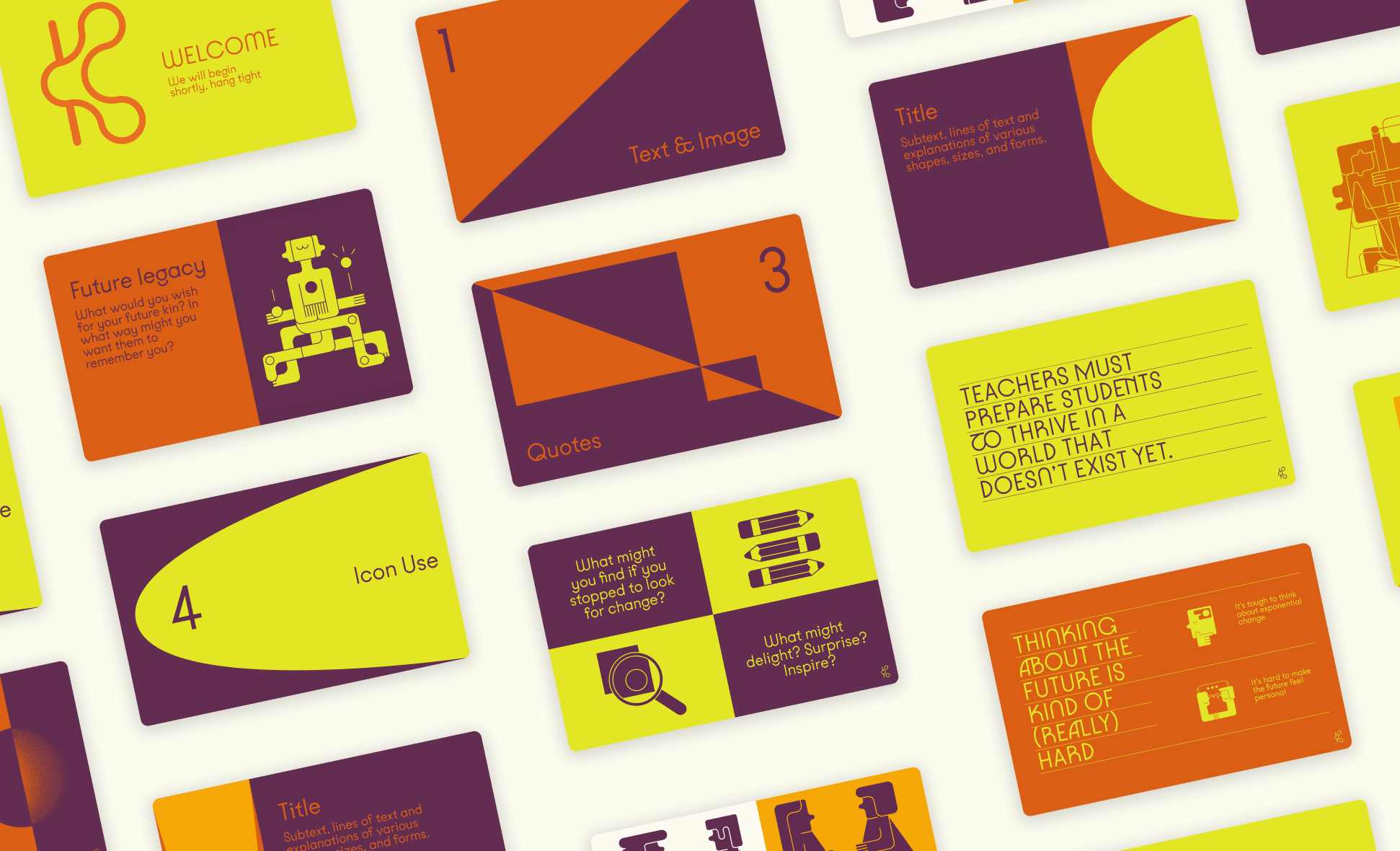
Over the course of several months, Avenear helped the K12 lab identify a design direction for their brand. As part of the process, three Design Seeds (aesthetic and conceptual themes) were explored, with one being selected for further development. Several rounds of iterations and refinements were completed before landing on a retro-futurism inspired palette with thick, bold, illustrations.
Design Seeds identified included Perspective Shift (as futures thinking is all about expanding our way of seeing), Gradient Focus (as futures thinking is all about defining the shape of things to come), and Bold Moves (as one must be bold to bravely announce their vision of the future to the world). The Seed that was selected for further development was Bold Moves, with hints of Gradient Focus coming in to play.
Synchronization
Aligning on vision for the brand, key deliverables, process and expectations.
Exploration
Finding and presenting three Design Seeds for further development.
Development
Creation of a unified design brand using the selected Seed (theme).
Refinement
Final production of deliverables. Documentation and packaging.


Results
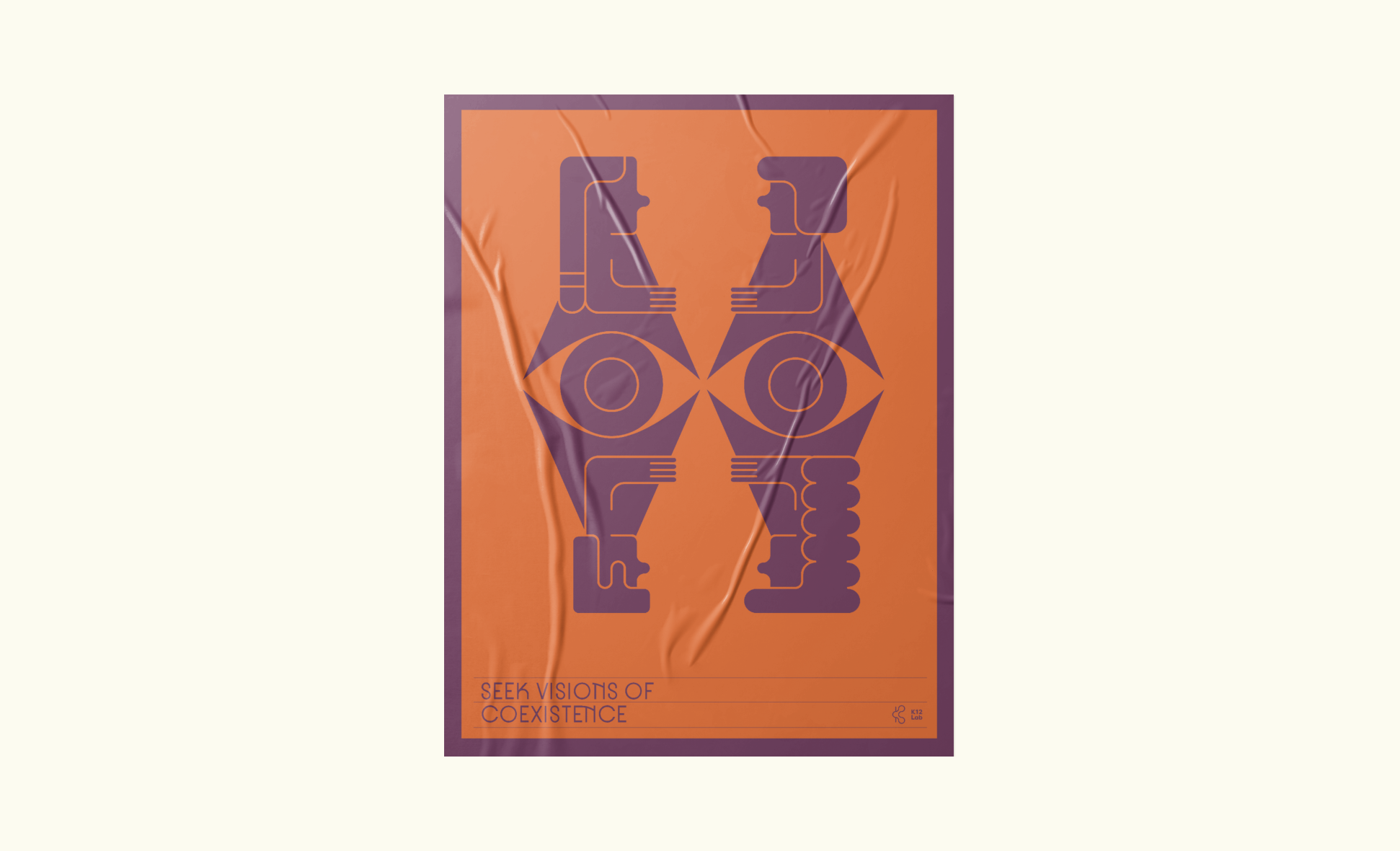
The K12 Brand identity was inspired by futures, and defined through design. The colour palette was inspired by retro-futurism while the illustrations sought inspiration from ancient imagery to create a link between past and future. The logo represents the forging of futures from the present, while simultaneously resembling a K for K12 lab. It’s shape starts off as one, and branches into two, highlighting the divergent paths of the future.
In total, a digital brand guidebook was created, as well as 5 illustrations, along with 10 smaller illustrations to serve as icons. A digital slide deck and various brand materials were provided to the team to act as a guide for application of the brand across materials.